Alerts
Alerts are used to give status, feedback or information to the users based on certain action performed with a descriptive message.
Example of simple alerts
There are 6 types of alerts which can be used based on different contexts.
The five different alerts are : success alert, error alert, warning alert, primary alert, secondary alert, dark alert and light alert.
In order to use the alerts you can just add the class name alert to your text container div and you can add another class based on the type of alert you want to use like alert-primary, alert-sucess, alert-error, alert-warning, alert-dark, alert-light.
Example of alerts with icon
Alerts can have icon relevant to the alert message to attract user's attention.
Example of alerts with close button
Alerts can have close button so that the user can close the alert box.
JavaScript
Avatar
Avatars can be used to display user's profile picture on user profile, comments, navigation bar etc.
Example of simple avatars
Avatar is avilable in 5 different sizes. You can use a image and add the class img-responsive and img-round to make the image round and responsive.
Add class avatar to the image container div and also add class for the avatar size like avatar-xl, avatar-lg, avatar-md, avatar-sm, avatar-xs.
Badge
Badges are used to display status or notifications. It can be used with text, images, or icons to grab user's attention.
Example of basic badge
There are 6 variations of basic badges that can be used in different context.
You just need to add a class badge to wrap the text as a basic badge.
You can also add class for different variations of basic badges like badge-primary, badge-green, badge-red, badge-yellow, badge light.
Example of heading with basic badge SOLD
Example of heading with primary badge TRENDING
Example of heading with green badge NEW
Example of heading with red badge SALE
Example of heading with yellow badge BEST-SELLER
Example of paragraph with light badge COMING SOON
Badge on Avatars
You can add status badge to an avatar for displaying the status of the user.
Check the code below to add a status badge on your avatar.
Cards
Cards are used as a container where related information are stored at one place. There are different types of card which can be used in different scenarios like horizontal card, vertical card, card with badge, card with text overlay, card with close button etc.
Example of horizontal card
There are two variants of the horizontal card, one is a basic horizontal card and the second is a horizontal card with badge.
You can check the code below to copy the component in your web page.
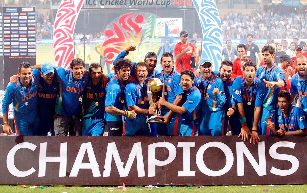
Example of small horizontal card
Small horizontal card can be used to display notifications.
KL Rahul is live now
Example of Vertical card
There are three variants of the vertical card. You can check the code below to copy the component in your web page.

Example of Card with text overlay and text only card with dismiss button
Below are two other variants of card one for displaying a card with text overlay and the second is text only card that can be closed by the user.
Check the code below to copy the component in your web page.

KL Rahul to lead LSG
×Former KXIP skipper KL Rahul is all set to lead Lucknow Super Giants in IPL 2022...
Image
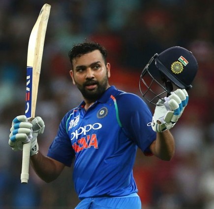
Images can be responsive to fit the container height and width and can be customised to be in round shape.
Example of responsive image
You need to add class img-responsive to the image in order to make the image responsive and fit to its container height and width.
Example of round image
You need to add class img-round to the image in order to make the image round shaped.

Input
Input fields are used to take user inputs. There are different types of input fields like text field, password field, email field, phone field, textarea field etc.
Example of contact form with input fields and required validations
Below is a basic contact form example with text field, email field, phone field and textarea field with required validation applied on certain fields.
You can check the code below and copy the form component to add it in your web page.
Example of login form with validation and error styling
Below is an example of login form with custom validation through JavaScript. You can check the code below and copy the component along with the javascript code and integrate it into your web page however, it is advisable to change the field id names according to your usage.
JavaScript
List
Lists can be used to display a collection of items in ordered or un-ordered manners.
Example of ordered list.
Below are the different types of ordered list which can be used anywhere in your website where you want to display a collection of items in an ordered manner.
You can check the code below and copy the list component to add it in your web page.
- Rohit Sharma in the list
- KL Rahul in the list
- Virat Kohli in the list
- Rohit Sharma in the reversed list
- KL Rahul in the reversed list
- Virat Kohli in the reversed list
- Rohit Sharma in a list with lowercase roman
- KL Rahul in a list with lowercase roman
- Virat Kohli in a list with lowercase roman
- Rohit Sharma in a list with uppercase roman
- KL Rahul in a list with uppercase roman
- Virat Kohli in a list with uppercase roman
- Rohit Sharma in a list with lowercase alphabet
- KL Rahul in a list with lowercase alphabet
- Virat Kohli in a list with lowercase alphabet
- Rohit Sharma in a list uppercase alphabet
- KL Rahul in a list with uppercase alphabet
- Virat Kohli in a list with uppercase alphabet
Example of un-ordered list.
Below are the examples of un-ordered list which can be used anywhere in your website where you want to display a collection of items in an un-ordered manner.
You can check the code below and copy the list component to add it in your web page.
- Rohit Sharma in an un-ordered list with bullet
- KL Rahul in an un-ordered list with bullet
- Virat Kohli in an un-ordered list with bullet
- Rohit Sharma in an un-ordered list with square
- KL Rahul in an un-ordered list with square
- Virat Kohli in an un-ordered list with square
- Rohit Sharma in an un-ordered list with circle
- KL Rahul in an un-ordered list with circle
- Virat Kohli in an un-ordered list with circle
- Rohit Sharma in an un-ordered list with circle
- KL Rahul in an un-ordered list with circle
- Virat Kohli in an un-ordered list with circle
- Rohit Sharma
- KL Rahul
- Virat Kohli
Example of stacked list.
Below is and example of stacked list which can be used to display notifications.
You can add the desired element inside the li tag to stack it as list item
Modal
Modals are triggered at a particular action and postioned on the top layer over anything else on the page to display important information and it removes the scroll from the page. User can close it manually.
Example of modal
You need to have a wrapper div with the class modal-backdrop, inside which you can place your modal div with class modal
Below modal is divided into three part: modal-title, modal-content and modal-footer. However, you can add, modify or remove the child components of the modal according to your need.
Bleed Blue CSS
Live Demo
Clicking on the below 'Launch Modal' button will launch the modal and page scroll will be disabled, it can be closed by clicking on the 'CLOSE' button or the close icon on the modal.
JavaScript
The action of opening and closing modal is invoked by JavaScript
Typography
You can write different types of text using the text utilities in different contexts.
Example of Headings
You can use h1, h2, h3, h4, h5 h6 tags to use headings or you can also style your text like a heading using the corresponding class h1, h2, h3, h4, h5, h6
Example of h1 element
Example of h2 element
Example of h3 element
Example of h4 element
Example of h5 element
Example of h6 element
Example of paragraph
You can use p tag or add .p class to add a paragraph. Additionaly if you want to change the size of the paragraph text, you can add the corresponsing class text-sm-size, text-rg-size, text-lg-size and if you want to change the weight of the paragraph text, you can add the correspondig class text-light-weight, text-regular-weight, text-bold-weight.
Example of paragraph element
Example of small size text
Example of regular size text
Example of large size text
Example of light weight text
Example of regular weight text
Example of bold text
Example of text alignment
You can align the text to left, right or center by adding a class like text-left, text-right, text-center to an element with text.
Example of left aligned text
Example of right aligned text
Example of center aligned text
Other styles on text
- You can underline the text by adding a class text-underline
- You can strike through the text by adding a class text-strike
- You can change the text color to primary by adding a class primary-text
- You can change the text color to secondary by adding a class secondary-text
- You can change the text color to dark by adding a class dark-text
- You can change the text color to gray by adding a class inactive-text
- You can change the text color to red by adding a class danger-text
- You can change the text color to green by adding a class success-text
Example of underlined text
Example of striked through text
Example of primary text
Example of secondary through text
Example of dark text
Example of gray text
Example of red text
Example of green text